Schools were paying for a communication platform. Their staff and parents had quietly stopped using it.
Imagine you are a teacher trying to send a last-minute alert to parents about a schedule change. You open the app, get lost in the navigation, hit an unexpected permission screen, give up, and send a mass email instead. Now imagine that happening across an entire school district, every single week and not just for teachers, but for administrators trying to broadcast urgent notices, and parents trying to report a child's absence or follow up on a message.
That was the reality for SchoolMessenger users. The platform, built to handle direct messages, group chats, broadcast alerts, and absence reporting across schools and families had been accumulating frustration quietly across every one of those flows. Low app store ratings. Users abandoning onboarding halfway through. Critical communications falling through the gaps because the people who needed to send or receive them had given up and found another way.
The product was not broken in one dramatic way. It was broken in dozens of small, exhausting ways and the people who suffered most were busy teachers, overwhelmed parents, and administrators responsible for keeping entire communities informed.
The product was not broken in one dramatic way. It was broken in dozens of small, exhausting ways and the people who suffered most were busy teachers, overwhelmed parents, and administrators responsible for keeping entire communities informed.
The product was not broken in one dramatic way. It was broken in dozens of small, exhausting ways and the people who suffered most were busy teachers, overwhelmed parents, and administrators responsible for keeping entire communities informed.
The stakes sharpened when SchoolMessenger's largest enterprise client flagged their concerns. A contract renewal was on the line. The business needed a solution, but more importantly, the users needed one. My job was to lead the redesign that would deliver both.
The goal was simple: every user should be able to complete any task on their own, first time, without help.
The redesign covered onboarding, two-way and group messaging, admin broadcasts, contact management, attendance tracking, and a refreshed visual identity across mobile and desktop, for all three user roles.
Mapped the full information architecture across all three user roles. Surfacing where navigation was unnecessarily deep and where features were duplicated or hidden.
Flows mapped for every critical task per persona. This revealed where the old app added unnecessary steps and defined the shortest path to task completion for each user type.
Lo-fi first to keep feedback focused on structure rather than aesthetics. Onboarding, messaging, and other major flows went through multiple iterations before advancing to hi-fi.
Cleaner navigation, refreshed brand identity, and consistent interaction patterns across all three roles on both mobile and desktop. Every screen prototyped and validated through usability testing before handoff to engineering.
Built alongside the screens, not after. Every component grounded in real usage, giving engineering a single source of truth and making future updates significantly faster to ship.
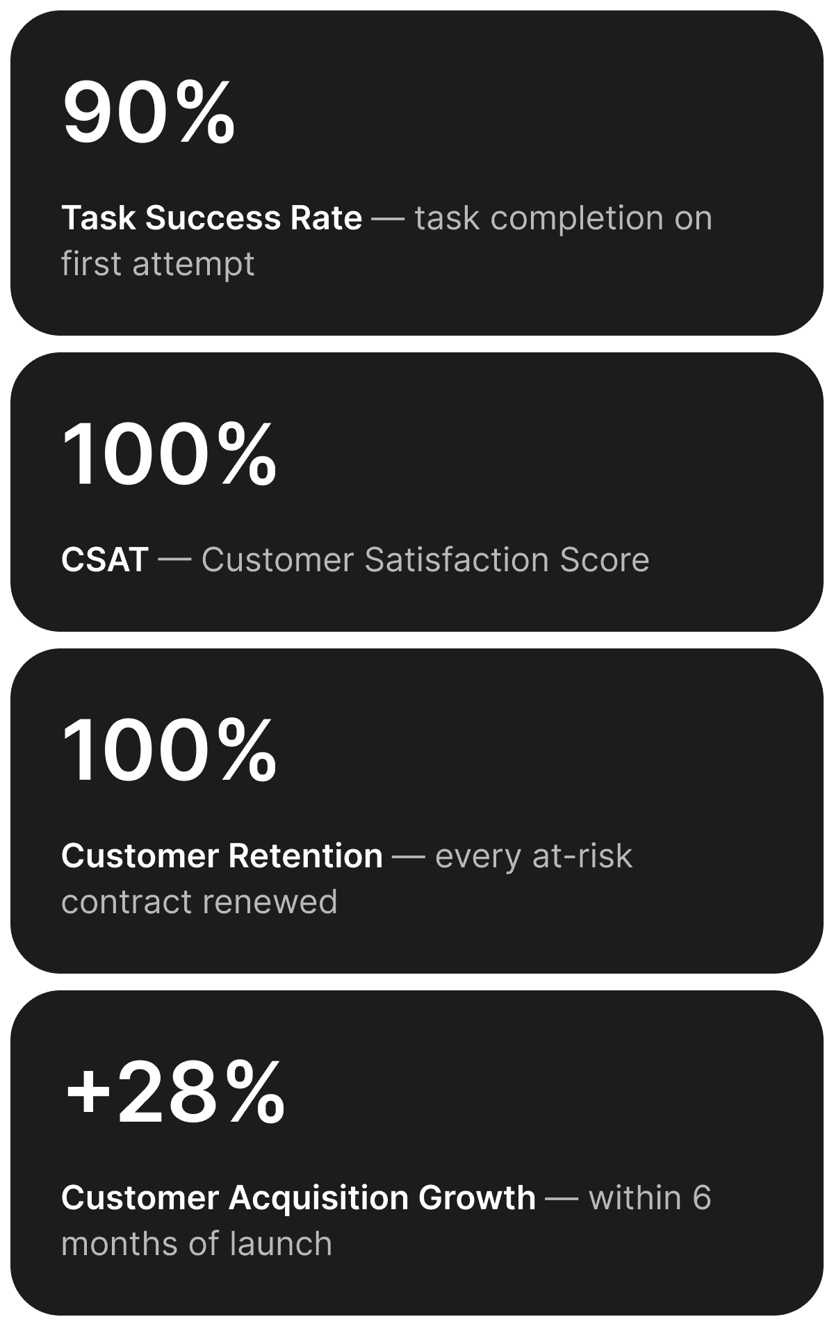
100% of at-risk clients renewed. Within six months, 28% more schools and districts had signed on.
The redesigned SchoolMessenger launched to production and the results were immediate. The at-risk contract was renewed. Other districts took notice.
More schools. More districts. More families reached.
That 28% was not just a business metric. It meant new school districts onboarding onto the platform, more administrators reliably reaching parents, and thousands more families getting the updates that keep children informed and safe. A product that had been quietly losing trust became one that other schools actively chose to adopt.