Datum: How I Built a Design System That Unified the Company's Product Language and Scaled With It

Datum, like every product, needs structure — a way to reduce assumptions, speed up workflow across teams, and ensure consistency across every surface. What I built was a ground-up design system: colour tokens, a complete component library, and documentation that gave a large, fast-moving team a single source of truth and a shared language to build from.

Year

2025

Role

Product Designer

Team

Design, Product

  • The Story

The MVP proved the product. Now it needed to scale.

Datum had validated its idea. The MVP was done, the product direction was clear, and full launch was next, which meant a large cross-functional team was about to build simultaneously on a product that finally had real momentum.

That's when the absence of a design system becomes expensive — when speed and consistency have to coexist, and a decision made by one designer needs to hold across every screen another engineer builds weeks later.

The brief was clear: build the single source of truth before anything else ships. Not a collection of reusable frames, not a shared colour palette in a side file. A proper design system.

The brand guidelines existed. The colours were defined. The product had direction. My job was to translate all of that into infrastructure that the whole company could build on without breaking. No existing patterns to reference, no graveyard of old decisions to learn from, just the brand guidelines, a blank file, and a product that needed to ship.

  • The Problem

No shared design language. No single source of truth. And inconsistencies waiting to happen.

Datum came into this with the right raw materials: brand colours, guidelines, tone of voice, a product with a clear identity. What didn't exist yet was the layer between those brand decisions and the actual product. The system that translates "these are our colours" into "this is exactly which colour goes on a primary button in a disabled state," documented in a way that removes assumption entirely.

Without that layer, a team defaults to individual judgment. Subtly different shades of the same colour. Components built twice because no one knew one already existed. Handoff friction on every ticket. Inconsistency that's invisible on any single screen but obvious the moment you look at the product as a whole.

  • The Approach

Foundations first. Components second. Never the other way around.

The system followed a deliberate sequence, each phase only beginning once the previous one was stable.

  1. Token definition

    Colour first — 14 named palettes, 96 tokens in total, each with a full scale and documented use cases. Typography followed with a clear hierarchy from display to caption. Spacing, grids, and layout foundations came next, all built on an 8px base unit.

  1. Component library

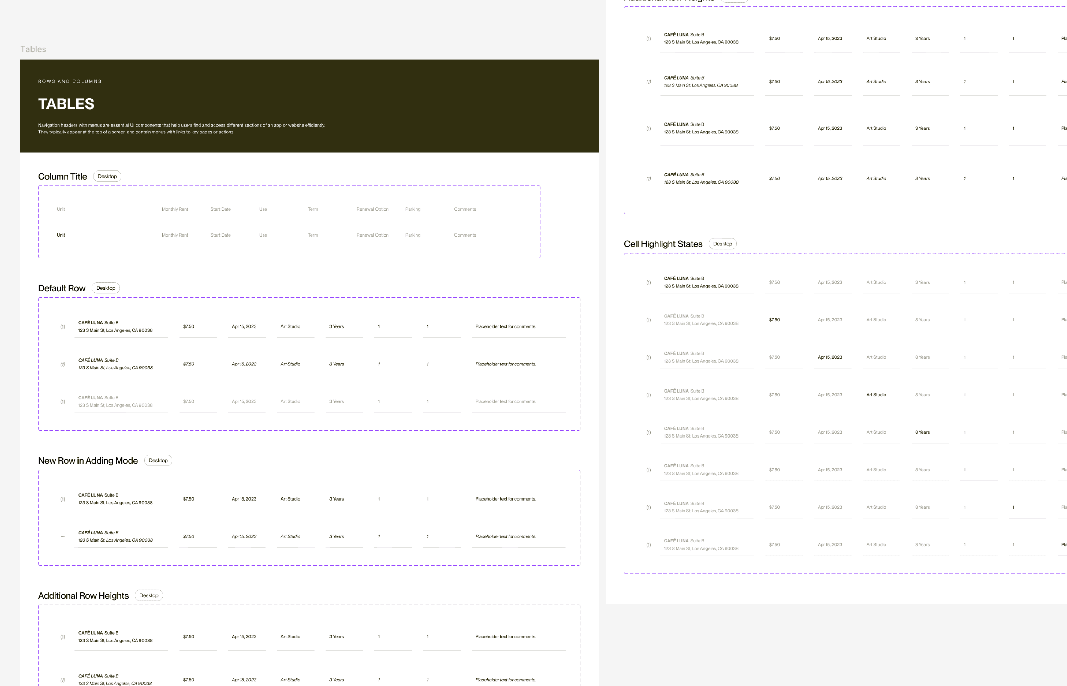
    With foundations locked, every component was built from the ground up as a proper component set — buttons, inputs, dropdowns, modals, headers, tables, icons, with full state and variant coverage. The standard: pick up any component and know exactly what you're getting, without asking anyone.

  1. Documentation and handoff

    Each component is documented with naming conventions, usage rules, and state guidance. Token structure is mapped directly to developer output with no interpretation required on the engineering side.

  • The Design

Every token named. Every component documented. Nothing left to interpretation.

Color — All colours were tied to real product use cases. Primary and Secondary for core actions. Teal for data states. Bouganvillea, Gold, and Porsche for accent and status. Neutral, Slate, and Foundation for structure and surface. Error, Warning, and Sage for system feedback. No colour exists in the system without a reason.

Typography — A complete type hierarchy from display headlines to captions, consistent across all product surfaces.

Core components — Buttons, input fields, dropdowns, modals, headers, tables, and icons, all built as variant-rich component sets and continuously maintained as the product evolves.

  • The Impact

One language. One foundation. Still going.

One source of truth for a company of over 50. Designers, engineers, and product managers all building from the same foundation.

Decisions that used to require back-and-forth became lookups. Handoffs became cleaner because the token structure mapped directly into code. Inconsistencies that would have accumulated across parallel workstreams were prevented before they could form. New team members had a reference that answered their questions before they needed to ask.

And the system is still being built on. As Datum has scaled since launch, new components have been added and existing ones updated. The system grows with the product rather than against it. A design system that outlives the sprint it was built in is a design system that worked. This one is still going.

Next Project
Let's build something extraordinary

Have a project in mind?
I'd love to hear from you.

Have a project in mind? I'd love to hear from you.

Let's build something extraordinary

Or shoot me an email at giftobidokachi@gmail.com

Create a free website with Framer, the website builder loved by startups, designers and agencies.